

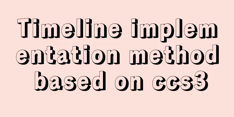
CSS3 timeline animation

|
Achieve results
html
<h2>CSS3 Timeline</h2>
<p>Please set the $vertical variable to false to see the horizontal version.</p>
<ul id='timeline'>
  <li class='work'>
    <input class='radio' id='work5' name='works' type='radio' checked>
    <div class="relative">
      <label for='work5'>Lorem ipsum dolor sit amet</label>
      <span class='date'>12 May 2013</span>
      <span class='circle'></span>
    </div>
    <div class='content'>
      <p>
        I am a man who has no patience, but I am a man who has no patience. I am a man who has no patience, but I am a man who has no patience. I am a man who has no patience, but I am a man who has no patience. I am a man who has no patience, but I am a man who has no patience. I am a man who has no patience, but I am a man who has no patience.
      </p>
    </div>
  </li>
  <li class='work'>
    <input class='radio' id='work4' name='works' type='radio'>
    <div class="relative">
      <label for='work4'>Lorem ipsum dolor sit amet</label>
      <span class='date'>11 May 2013</span>
      <span class='circle'></span>
    </div>
    <div class='content'>
      <p>
        I am a man who has no patience, but I am a man who has no patience. I am a man who has no patience, but I am a man who has no patience. I am a man who has no patience, but I am a man who has no patience. I am a man who has no patience, but I am a man who has no patience. I am a man who has no patience, but I am a man who has no patience.
      </p>
    </div>
  </li>
  <li class='work'>
    <input class='radio' id='work3' name='works' type='radio'>
    <div class="relative">
      <label for='work3'>Lorem ipsum dolor sit amet</label>
      <span class='date'>10 May 2013</span>
      <span class='circle'></span>
    </div>
    <div class='content'>
      <p>
        I am a man who has no patience, but I am a man who has no patience. I am a man who has no patience, but I am a man who has no patience. I am a man who has no patience, but I am a man who has no patience. I am a man who has no patience, but I am a man who has no patience. I am a man who has no patience, but I am a man who has no patience.
      </p>
    </div>
  </li>
  <li class='work'>
    <input class='radio' id='work2' name='works' type='radio'>
    <div class="relative">
      <label for='work2'>Lorem ipsum dolor sit amet</label>
      <span class='date'>09 May 2013</span>
      <span class='circle'></span>
    </div>
    <div class='content'>
      <p>
        I am a man who has no patience, but I am a man who has no patience. I am a man who has no patience, but I am a man who has no patience. I am a man who has no patience, but I am a man who has no patience. I am a man who has no patience, but I am a man who has no patience. I am a man who has no patience, but I am a man who has no patience.
      </p>
    </div>
  </li>
  <li class='work'>
    <input class='radio' id='work1' name='works' type='radio'>
    <div class="relative">
      <label for='work1'>Lorem ipsum dolor sit amet</label>
      <span class='date'>08 May 2013</span>
      <span class='circle'></span>
    </div>
    <div class='content'>
      <p>
        I am a man who has no patience, but I am a man who has no patience. I am a man who has no patience, but I am a man who has no patience. I am a man who has no patience, but I am a man who has no patience. I am a man who has no patience, but I am a man who has no patience. I am a man who has no patience, but I am a man who has no patience.
      </p>
    </div>
  </li>
</ul>
CSS
/* -------------------------------------
 * For horizontal version, set the
 * $vertical variable to false
 * ------------------------------------- */
/* -------------------------------------
 * General Style
 * ------------------------------------- */
@import url(https://fonts.googleapis.com/css?family=Noto+Sans);
body {
  max-width: 1200px;
  margin: 0 auto;
  padding: 0 5%;
  font-size: 100%;
  font-family: "Noto Sans", sans-serif;
  color: #eee9dc;
  background: #48b379;
}

h2 {
  margin: 3em 0 0 0;
  font-size: 1.5em;
  letter-spacing: 2px;
  text-transform:uppercase;
}

/* -------------------------------------
 * timeline
 * ------------------------------------- */
#timeline {
  list-style: none;
  margin: 50px 0 30px 120px;
  padding-left: 30px;
  border-left: 8px solid #eee9dc;
}
#timeline li {
  margin: 40px 0;
  position: relative;
}
#timeline p {
  margin: 0 0 15px;
}

.date {
  margin-top: -10px;
  top: 50%;
  left: -158px;
  font-size: 0.95em;
  line-height: 20px;
  position: absolute;
}

.circle {
  margin-top: -10px;
  top: 50%;
  left: -44px;
  width: 10px;
  height: 10px;
  background: #48b379;
  border: 5px solid #eee9dc;
  border-radius: 50%;
  display: block;
  position: absolute;
}

.content {
  max-height: 20px;
  padding: 50px 20px 0;
  border-color: transparent;
  border-width: 2px;
  border-style: solid;
  border-radius: 0.5em;
  position: relative;
}
.content:before, .content:after {
  content: "";
  width: 0;
  height: 0;
  border: solid transparent;
  position: absolute;
  pointer-events: none;
  right: 100%;
}
.content:before {
  border-right-color: inherit;
  border-width: 20px;
  top: 50%;
  margin-top: -20px;
}
.content:after {
  border-right-color: #48b379;
  border-width: 17px;
  top: 50%;
  margin-top: -17px;
}
.content p {
  max-height: 0;
  color: transparent;
  text-align: justify;
  word-break: break-word;
  hyphens: auto;
  overflow: hidden;
}

label {
  font-size: 1.3em;
  position: absolute;
  z-index: 100;
  cursor: pointer;
  top: 20px;
  transition: transform 0.2s linear;
}

.radio {
  display: none;
}

.radio:checked + .relative label {
  cursor: auto;
  transform: translateX(42px);
}
.radio:checked + .relative .circle {
  background: #f98262;
}
.radio:checked ~ .content {
  max-height: 180px;
  border-color: #eee9dc;
  margin-right: 20px;
  transform: translateX(20px);
  transition: max-height 0.4s linear, border-color 0.5s linear, transform 0.2s linear;
}
.radio:checked ~ .content p {
  max-height: 200px;
  color: #eee9dc;
  transition: color 0.3s linear 0.3s;
}

/* -------------------------------------
 * mobile phones (vertical version only)
 * ------------------------------------- */
@media screen and (max-width: 767px) {
  #timeline {
    margin-left: 0;
    padding-left: 0;
    border-left: none;
  }
  #timeline li {
    margin: 50px 0;
  }

  label {
    width: 85%;
    font-size: 1.1em;
    white-space: nowrap;
    text-overflow: ellipsis;
    overflow: hidden;
    display: block;
    transform: translateX(18px);
  }

  .content {
    padding-top: 45px;
    border-color: #eee9dc;
  }
  .content:before, .content:after {
    border: solid transparent;
    bottom: 100%;
  }
  .content:before {
    border-bottom-color: inherit;
    border-width: 17px;
    top: -16px;
    left: 50px;
    margin-left: -17px;
  }
  .content:after {
    border-bottom-color: #48b379;
    border-width: 20px;
    top: -20px;
    left: 50px;
    margin-left: -20px;
  }
  .content p {
    font-size: 0.9em;
    line-height: 1.4;
  }

  .circle, .date {
    display: none;
  }
}
The above is the details of how to implement timeline animation with CSS3. For more information about CSS3 timeline, please pay attention to other related articles on 123WORDPRESS.COM! |
>>: Vue implements custom "modal pop-up window" component example code


Recommend
Alibaba Cloud OSS access rights configuration (RAM permission control) implementation
Scenario You need to authorize the tester to use ...
How to use pdf.js to preview pdf files in Vue
When we preview PDF on the page, some files canno...
JS implements the snake game
Table of contents 1. Initialization structure 2. ...
Web Design TabIndex Element
TabIndex is to press the Tab key to sequentially o...
How to use nginx to simulate canary release
This article introduces blue-green deployment and...
Examples of adding, modifying, deleting and clearing values in MySQL database
3. MySQL Data Management The first method: not re...
Analysis of the reasons why Vue3 uses Proxy to implement data monitoring
Vue data two-way binding principle, but this meth...
Solve the problem of MySQL reporting Invalid default value for ''operate_time'' error
Execute the create table statement in the databas...
Detailed explanation of the process of nginx obtaining the real source IP after passing through multiple layers of proxy
question Nginx takes $remote_addr as the real IP ...
How to change the root password in MySQL 5.7
Starting from MySQL 5.7, many security updates ha...
Build a server virtual machine in VMware Workstation Pro (graphic tutorial)
The VMware Workstation Pro version I use is: 1. F...
A quick solution to accidentally delete MySQL data (MySQL Flashback Tool)
Overview Binlog2sql is an open source MySQL Binlo...
Detailed explanation of mysql execution plan id is empty (UNION keyword)
Introduction During the work process, slow querie...
Solution to changing the data storage location of the database in MySQL 5.7
As the data stored in the MySQL database graduall...
Vue login function implementation
Table of contents Written in front Login Overview...