
CSS to achieve the like card effect in the lower right corner of the web page (example code)
|
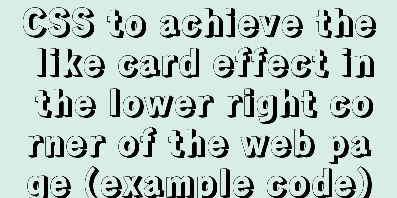
Effect
To implement HTML, first prepare a clean HTML page and write the nodes:
<!DOCTYPE html>
<html lang="en">
<head>
    <meta charset="UTF-8">
    <meta name="viewport" content="width=device-width, initial-scale=1.0">
    <title>Document</title>
    <link rel="styleSheet" type="text/css" href="./style.css" />
</head>
<body>

    <div>
        <section class="card">
            <div class="card-top">
                Was this page helpful?
            </div>
            <div class="card-bottom">
                <div title="👍">
                    YES
                </div>
                <div title="👎">
                    NO
                </div>
            </div>
        </section>
    </div>
</body>
</html>
CSS Create a
body {
    margin: 0;
    padding: 0;
    /* Switch between horizontal and vertical screens on mobile*/
    -ms-text-size-adjust: 100%;
    -webkit-text-size-adjust: 100%;
    /* Rendering optimization */
    -moz-osx-font-smoothing: grayscale;
    -webkit-font-smoothing: antialiased;
    font-size: 15px;
}

* {
    box-sizing: border-box;
    font-family: "Fira Code", Hack, Consolas;
}

:root {
    --color: #ff4081
}

section {
    margin: 0;
    padding: 0;
}

.card {
    font-size: inherit;
    position: fixed;
    right: 0;
    bottom: 0;
    background-color: var(--color);
    border-radius: 4px 4px 0 0;
    box-shadow: 0 16px 60px 0 rgba(86, 91, 115, 0.2);
    opacity: 0.5;
    transform: translateX(-20px) translate(103px, 27px) rotate(35deg);
    transition: all 400ms cubic-bezier(0.26, 0.6, 0.4, 1.54);
}

.card:hover {
    opacity: 1;
    transform: translate(0, 0) rotate(0deg) translateX(-20px);
}

.card-top {
    height: 50px;
    line-height: 50px;
    padding: 0 1rem;
    text-align: center;
    user-select: none;
    color: #fff;
}

.card-bottom {
    display: flex;
    background-color: #fff;
    justify-content: space-evenly;
}

.card-bottom div {
    padding: 1rem;
    cursor: pointer;
    font-weight: 700;
    text-transform:uppercase;
    text-decoration: none ;
    color: var(--color);
    transition: all .2s linear;
}

.card-bottom div:hover {
    text-shadow: 0 1px 1px var(--color);
    letter-spacing: 1px;
}
Two animations:
Animation process: Note that Summarize This is the end of this article about how to use CSS to create a small like card effect in the lower right corner of a web page (example code). For more related CSS content about the small like card effect in the lower right corner of a web page, please search 123WORDPRESS.COM’s previous articles or continue to browse the related articles below. I hope you will support 123WORDPRESS.COM in the future! |
<<: How to prevent Flash from covering HTML div elements
>>: Is it easy to encapsulate a pop-up component using Vue3?


Recommend
Detailed installation history of Ubuntu 20.04 LTS
This article records the creation of a USB boot d...
Summary of basic usage of CSS3 @media
//grammar: @media mediatype and | not | only (med...
How to use not in to optimize MySql
Recently, when using select query in a project, I...
How to detect whether a file is damaged using Apache Tika
Apache Tika is a library for file type detection ...
JavaScript to achieve a simple magnifying glass effect
There is a picture in a big box. When you put the...
Detailed explanation of basic data types in mysql8.0.19
mysql basic data types Overview of common MySQL d...
React's component collaborative use implementation
Table of contents Nesting Parent-child component ...
How to view MySQL links and kill abnormal links
Preface: During database operation and maintenanc...
Solve the problem of using less in Vue
1. Install less dependency: npm install less less...
Detailed explanation of triangle drawing and clever application examples in CSS
lead Some common triangles on web pages can be dr...
MySQL 5.7.29 + Win64 decompression version installation tutorial with pictures and text
Download the official website Choose the version ...
Detailed explanation of four solutions for MySQL active-active synchronous replication
Table of contents Master-Master Synchronization S...
5 tips for writing CSS to make your style more standardized
1. Arrange CSS in alphabetical order Not in alphab...
Steps to install MySQL on Windows using a compressed archive file
Recently, I need to do a small verification exper...
How to set MySQL foreign keys for beginners
Table of contents The role of foreign keys mysql ...