


From CSS 3D to spatial coordinate axis with source code
|
One time we talked about the dice rolling game. At that time, we used a steps attribute + sprite image to make frame animation. This is of course quite good, but in fact, this is not what I thought at the beginning. I wanted to use real 3D and animation to do it. This plan involves a lot of spatial knowledge. Today I will tell you how to play this CSS 3D. First, the effect picture:
Basic idea: three-layer structure: perspective container >> carrier >> specific 3D image. Perspective container: determines the 3D rendering effect. The perspective attribute here receives parameters in pixels. The larger the perspective value, the farther the eyes are from the object being observed, and the smaller the value, the closer the eyes are to the object being observed. Without the perspective attribute, the viewing angle cannot be adjusted.
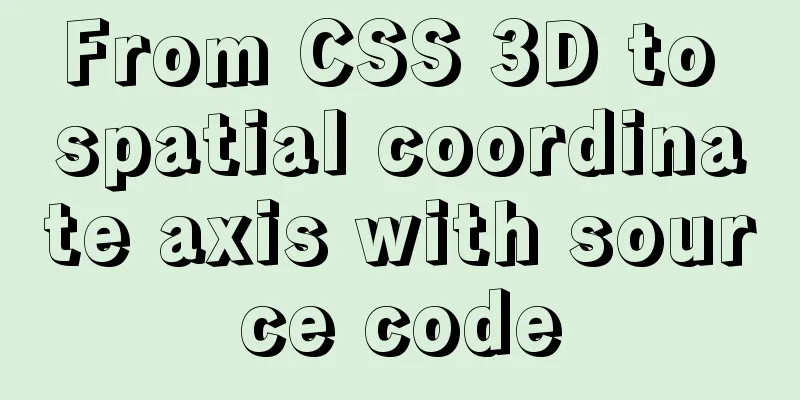
Carrier: Supports 3D images The biggest difference between this vector and ordinary HTML tags is that it has an additional attribute: transform-style:preserve-3d. Indicates that it supports 3D image display. If this attribute is missing, the 3D graphics that have undergone 3D conversion will be compressed into a 2D plane and will not be able to present a 3D effect, because the container is flat, even if the content is 3D. Concrete 3D images: conversion from 2D to 3D The 3D images here are all converted from 2D plane images, so how to convert them? You need to use the translateX, translateY, translateZ attributes, of course the abbreviation is translate-3d, and rotateX, rotateY, rotateZ and so on. The specific rules of translate and rotate are based on the famous reference picture below: three-dimensional coordinate diagram.
First, let's talk about the rules of translate. There is no need to explain this in detail. Just refer to it. For example, translateZ(-100px) in this picture is equivalent to moving the image 100px in the direction of the -z axis. A more vivid way of saying it is "sunken 100px into the screen." translateX, translateY and so on. The difficulty lies in rotate. Let me tell you a very simple rule of judgment: if the positive axis is facing the eyes, the clockwise rotation angle is positive, and the counterclockwise rotation angle is negative. It's that simple. For example, if we want to make a 3D dice, first, the six planes are placed in the center of the three-dimensional coordinate system as shown in the figure above. Their sizes are the same as the carrier. To turn them into a dice, the following transformations need to be done: (Note: The length and width of the carrier and the six faces are both 200px)
Just refer to the 3D picture and make some gestures and you will know what is going on. Attach all source code:
<template>
  <div class="box">
    <section class="cube">
      <div class="front">Front</div>
      <div class="back">Back</div>
      <div class="left">Left</div>
      <div class="right">Right</div>
      <div class="top">Above</div>
      <div class="bottom">Below</div>
    </section>
  </div>
</template>
<style lang="less" scoped>
.box {
  width: 100%;
  height: 100%;
  perspective: 500px;
}
.cube {
  position: relative;
  width: 200px;
  height: 200px;
  margin: 100px auto;
  color: #ff92ff;
  font-size: 36px;
  font-weight: 100;
  text-align: center;
  line-height: 200px;
  transform-style: preserve-3d;
  transform: rotateX(-50deg) rotateY(-50deg) rotateZ(0deg);
  // animation: move 8s infinite linear;
  @keyframes move {
    0% {
      transform: rotateX(0deg) rotateY(0deg) rotateZ(0deg);
    }
    100% {
      transform: rotateX(720deg) rotateY(360deg) rotateZ(360deg);
    }
  }
  div {
    position: absolute;
    width: 100%;
    height: 100%;
    border: 10px solid #66daff;
    border-radius: 20px;
    background-color: rgba(51, 51, 51, 0.3);
  }
  .front {
    transform: translateZ(100px);
  }
  .back {
    transform: translateZ(-100px) rotateY(180deg);
  }
  .left {
    transform: translateX(-100px) rotateY(-90deg);
  }
  .right {
    transform: translateX(100px)rotateY(90deg);
  }
  .top {
    transform: translateY(-100px) rotateX(90deg);
  }
  .bottom {
    transform: translateY(100px) rotateX(-90deg);
  }
}
</style>
Summarize The above is what I introduced to you from CSS 3D to spatial coordinate axes with source code. I hope it will be helpful to you. If you have any questions, please leave me a message and I will reply to you in time! |
<<: Deployment and Chinese translation of the docker visualization tool Portainer
>>: IE8 uses multi-compatibility mode to display web pages normally


Recommend
How to view Linux ssh service information and running status
There are many articles about ssh server configur...
Detailed explanation of how to use the mysql backup script mysqldump
This article shares the MySQL backup script for y...
Pure CSS to achieve candle melting (water droplets) sample code
Achieve results Implementation ideas The melting ...
mysql8.0.11 winx64 manual installation and configuration tutorial
First of all, let me talk to you about my daily l...
Several common ways to deploy Tomcat projects [tested]
1 / Copy the web project files directly to the we...
Detailed explanation of MySQL slow queries
Query mysql operation information show status -- ...
How to install redis in docker and set password and connect
Redis is a distributed cache service. Caching is ...
Deep understanding of JavaScript syntax and code structure
Table of contents Overview Functionality and read...
An example of using CSS methodologies to achieve modularity
1. What are CSS methodologies? CSS methodologies ...
Key knowledge summary of Vue development guide
Table of contents Overview 0. JavaScript and Web ...
MySQL series tutorials for beginners
Table of contents 1. Basic concepts and basic com...
Detailed explanation of eight methods to achieve CSS page bottom fixed
When we are writing a page, we often encounter a ...
The best solution for resetting the root password of MySQL 8.0.23
This method was edited on February 7, 2021. The v...
On good design
<br />For every ten thousand people who answ...
mysql wildcard (sql advanced filtering)
Table of contents First, let's briefly introd...