


Example of making a butterfly flapping its wings with pure CSS3

|
Pure CSS3 makes a butterfly flapping its wings, see the effect first
How is it? The effect is pretty good, right? Above code: html
<div id="butterfly">
    <div class="leftSide"></div>
    <div class="body"></div>
    <div class="rightSide"></div>
</div>
CSS
body{
            background: url("./images/bg.jpg") no-repeat;
        }
        #butterfly{
            width: 600px;
            height: 500px;
            position: relative;
            transform: scale(0.35);
            transform-style: preserve-3d;
        }
        .leftSide{
            width: 267px;
            height: 421px;
            background: url("./images/leftSide.png") no-repeat;
            position: absolute;
            left: 26px;
            top: 40px;
            animation: left 2s infinite;
            z-index: 9999;
        }
        @keyframes left {
            0%{
                transform: rotateY(0deg);
                transform-origin: right center;
                perspective: 201px;

            }
            50%{
                transform: rotateY(70deg);
                transform-origin: right center;
                perspective: 201px;

            }
            100%{
                transform: rotateY(0deg);
                transform-origin: right center;
                perspective: 201px;
            }
        }
        @keyframes right {
            0%{
                transform: rotateY(0);
                transform-origin: left center;
                perspective: 201px;

            }
            50%{
                transform: rotateY(-70deg);
                transform-origin: left center;
                perspective: 201px;

            }
            100%{
                transform: rotateY(0);
                transform-origin: left center;
                perspective: 201px;

            }
        }
        .body{
            width: 152px;
            height: 328px;
            background: url("./images/body.png") no-repeat;
            position: absolute;
            margin: auto;
            left: 0;
            right: 0;
            bottom: 0;
            top: 0;
            z-index: 9999;
        }
        .rightSide{
            width: 284px;
            height: 460px;
            background: url("./images/rightSide.png") no-repeat;
            position: absolute;
            right: 26px;
            top: 58px;
            animation: right 2s infinite;
            z-index: 9999;
        }
Before that, let me introduce a few CSS properties; @keyframes
transform: rotateY()
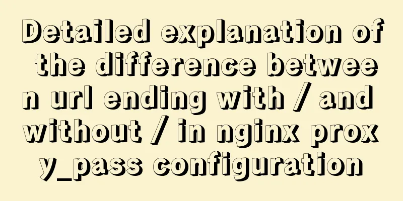
This picture clearly illustrates the xyz axes. In fact, students who have learned 3D modeling software such as 3DS MAX should be more familiar with the directions of these three axes. Implementation idea: First use the child and father to absolutely position the left wing, right wing, and body, and put them together. Then use transform's rotateY to rotate it along the y-axis. Use @keyframe animation for rotation here, and then repeat the action. We should also focus on the transform-style: preserve-3d; property. According to W3C, it enables the transformed child elements to retain their 3D transformation. That is, all sub-elements are presented in 3D space. On the contrary, if it is set to flat, all sub-elements are presented in 2D space. Demo download address The above is the full content of this article. I hope it will be helpful for everyone’s study. I also hope that everyone will support 123WORDPRESS.COM. |
<<: Object-Oriented Programming with XHTML and CSS
>>: MySQL 8.0.23 Major Updates (New Features)


Recommend
How to start jar package and run it in the background in Linux
The Linux command to run the jar package is as fo...
Summary of common functions of PostgreSQL regular expressions
Summary of common functions of PostgreSQL regular...
How to convert extra text into ellipsis in HTML
If you want to display extra text as ellipsis in ...
Synology NAS uses Docker container to build KMS activation server to activate Windows system and office (operation steps)
Preface The Windows system that can be activated ...
Detailed examples of converting rows to columns and columns to rows in MySQL
mysql row to column, column to row The sentence i...
Specific use of MySQL internal temporary tables
Table of contents UNION Table initialization Exec...
Detailed explanation of JavaScript error capture
Table of contents 1. Basic usage and logic 2. Fea...
HTML head structure
The following introduces the commonly used head s...
Setting up shadowsocks+polipo global proxy in Linux environment
1. Install shadowsocks sudo apt-get install pytho...
js to achieve a simple carousel effect
This article shares the specific code of js to ac...
Understanding the Lazy Loading Attribute Pattern in JavaScript
Traditionally, developers create properties in Ja...
Summary of MySQL common SQL statements including complex SQL queries
1. Complex SQL queries 1.1. Single table query (1...
Implementation of waterfall layout in uni-app project
GitHub address, you can star it if you like it Pl...
Simply master the use of horizontal line annotations and code comments in HTML
Horizontal Line Use the <hr /> tag to draw ...
Summary of three rules for React state management
Table of contents Preface No.1 A focus No.2 Extra...