Implementing long shadow of text in less in CSS3
|
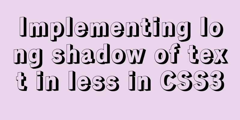
This article mainly introduces how to implement long text shadow in CSS3 LESS, and shares it with you. The details are as follows: question To achieve the following effect
Main knowledge points Font shadow in css text-shadowless Loops and merge code in syntax <div class="long-shadow">豮艸芔茻</div>
 .loop(@counter) when (@counter > 0) {
    .loop((@counter - 1));
    text-shadow+: (1px * @counter) (1px * @counter) #2d585a;
  }
 .long-shadow{
    overflow: hidden;
    background-color: #5f9ea0;
    width:800px;
    height: 160px;
    line-height: 160px;
    text-align: center;
    letter-spacing: 80px;
    color: #fff;
    font-size: 100px;
    .loop(200);
  }
This is the end of this article about how to implement long shadow of text in less in CSS3. For more relevant content about long shadow of text in less, please search previous articles on 123WORDPRESS.COM or continue to browse the related articles below. I hope you will support 123WORDPRESS.COM in the future! |
<<: Beginner's guide to building a website ⑥: Detailed usage of FlashFXP
>>: About if contains comma expression in JavaScript
Recommend
JavaScript Canvas implements Tic-Tac-Toe game
This article shares the specific code of JavaScri...
26 Commonly Forgotten CSS Tips
This is a collection of commonly used but easily ...
Common methods of Vue componentization: component value transfer and communication
Related knowledge points Passing values from pa...
MySQL5.7 master-slave configuration example analysis
MySQL5.7 master-slave configuration implementatio...
Detailed explanation of the box model size depends on its padding, margin, and border values
The box model specifies the size of the element b...
Basic ideas and codes for implementing video players in browsers
Table of contents Preface Summary of audio and vi...
Some thoughts and experience sharing on web page (website) design and production
First, before posting! Thanks again to I Want to S...
Pure CSS to modify the browser scrollbar style example
Use CSS to modify the browser scroll bar style ::...
Use Nginx to build a streaming media server to realize live broadcast function
Written in front In recent years, the live stream...
MySQL 8.0.12 winx64 detailed installation tutorial
This article shares the installation tutorial of ...
Detailed tutorial on installing MySQL 8.0 from source code on CentOS 7.4
Table of contents 1. Environment 2. Preparation 3...
js implements the pop-up login box by clicking the pop-up window
This article shares the specific code of js to re...
Tips for adding favicon to a website: a small icon in front of the URL
The so-called favicon, which is the abbreviation o...
jQuery treeview tree structure application
This article example shares the application code ...
Detailed explanation of how to automatically add prefix plugin after CSS3 packaging: autoprefixer
The project scaffolding built with vue-cli has al...

