


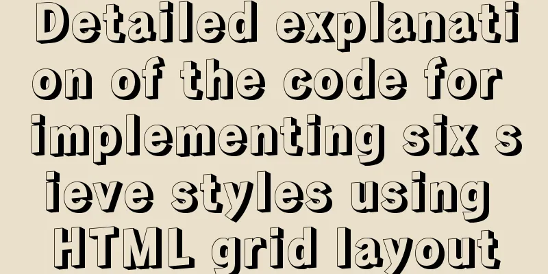
Detailed explanation of the code for implementing six sieve styles using HTML grid layout
|
First, attach the code below the effect diagram
<!DOCTYPE html>
<html>

	<head>
		<meta charset="UTF-8">
		<title></title>
		<style type="text/css">
			.big {
				width: 100px;
				height: 100px;
				background: skyblue;
				display: flex;
				margin-top: 20px;
			}
			.small {
				width: 10px;
				height: 10px;
				background: purple;
				border-radius: 5px;
			}

			.one {
				display: flex;
				justify-content: center;
				/*Cross axis*/
				align-items: center;
			}

			.two {
				display: flex;
				justify-content: space-around;
				align-items: center;
			}

			.two2 {
				display: flex;
				flex-direction: column;
				justify-content: space-around;
				align-items: center;
			}

			.three {
				display: flex;
				flex-direction: column;
				justify-content: space-between;
				align-items: center;
			}

			.four {
				display: flex;
				justify-content: space-around;
			}

			.four1 {
				display: flex;
				justify-content: space-around;
				align-items: center;
			}

			.four2 {
				display: flex;
				flex-direction: column;
				justify-content: space-around;
				align-items: center;
			}

			.five {
				display: flex;
				justify-content: space-around;
			}

			.five1 {
				display: flex;
				flex-direction: column;
				justify-content: space-around;
				align-items: center;
			}

			.five2 {
				display: flex;
				flex-direction: row;
				align-self: center;
			}

			.six {
				display: flex;
				justify-content: space-around;
			}

			.six1 {
				display: flex;
				flex-direction: column;
				justify-content: space-around;
				align-items: center;
			}
		</style>
	</head>

	<body>
		<div class="big one">
			<div class="small"></div>
		</div>
		<div class="big two">
			<div class="small"></div>
			<div class="small"></div>
		</div>
		<div class="big two2">
			<div class="small"></div>
			<div class="small"></div>
		</div>
		<div class="big three">
			<div class="small" style="align-self: flex-start;"></div>
			<div class="small" style="align-self: center;"></div>
			<div class="small" style="align-self: flex-end;"></div>
		</div>
		<div class="big three">
			<div class="small" style="align-self: flex-end;"></div>
			<div class="small" style="align-self: center;"></div>
			<div class="small" style="align-self: flex-start;"></div>
		</div>
		<div class="big four">
			<div class="four2">

				<div class="small"></div>
				<div class="small"></div>
			</div>
			<div class="four2">

				<div class="small"></div>
				<div class="small"></div>
			</div>
		</div>
		<div class="big five">
			<div class="five1">

				<div class="small"></div>
				<div class="small"></div>
			</div>
			<div class="five2">

				<div class="small"></div>
			</div>
			<div class="five1">

				<div class="small"></div>
				<div class="small"></div>
			</div>
		</div>

		<div class="big six">
			<div class="six1">
				<div class="small"></div>
				<div class="small"></div>
				<div class="small"></div>
			</div>
			<div class="six1">
				<div class="small"></div>
				<div class="small"></div>
				<div class="small"></div>
			</div>
		</div>
		<div class="big six">
			<div class="six1">
				<div class="small"></div>
				<div class="small"></div>
			</div>
			<div class="six1">
				<div class="small"></div>
				<div class="small"></div>
			</div>
			<div class="six1">
				<div class="small"></div>
				<div class="small"></div>
			</div>
		</div>
	</body>

</html>
Summarize This concludes this article on how to use HTML grid layout to implement six sieve styles. For more relevant HTML grid layout content, please search 123WORDPRESS.COM’s previous articles or continue browsing the following related articles. I hope you will support 123WORDPRESS.COM in the future! |
<<: Horizontal header menu implemented with CSS3
>>: Solve the problem of inconsistency between mysql time and system time in docker


Recommend
Mysql sorting to get ranking example code
The code looks like this: SELECT @i:=@i+1 rowNum,...
How to configure nginx to return text or json
Sometimes when requesting certain interfaces, you...
Implementation code for taking screenshots using HTML and saving them as local images
The specific code is as follows: <!DOCTYPE htm...
Detailed installation and configuration tutorial of mysql5.7 on CentOS
Install Make sure your user has permission to ins...
Detailed explanation of Linux one-line command to process batch files
Preface The best method may not be the one you ca...
Quickly solve the problem of slow startup after Tomcat reconfiguration
During the configuration of Jenkins+Tomcat server...
MySQL 5.7.20 Green Edition Installation Detailed Graphic Tutorial
First, let’s understand what MySQL is? MySQL is a...
Learn Hyperlink A Tag
ask: I have styled the hyperlink using CSS, but i...
TypeScript problem with iterating over object properties
Table of contents 1. Problem 2. Solution 1. Decla...
Analyze the role of rel="nofollow" in HTML and the use of rel attribute
Adding the rel="nofollow" attribute to ...
MySQL parameter related concepts and query change methods
Preface: In some previous articles, we often see ...
Several common methods of CSS equal height layout
Equal height layout Refers to the layout of child...
React implements import and export of Excel files
Table of contents Presentation Layer Business Lay...
jQuery implements navigation bar effect with expansion animation
I designed and customized a navigation bar with a...
The solution to the problem that the web table or div layer is stretched in the web page
<br />When we design web pages, we always en...